Not in the form of an SQL table on the screen. Not in the form of logs that only three people understand. But in a way that an engineer, a shift supervisor, or a technician from the neighboring department can open a dashboard and, in a couple of seconds, understand: data is flowing, polling is live, delays are normal, signals are changing, and perform minimal analytics.
To achieve this, I set up a combination of Grafana + ClickHouse for monitoring the data we collect from PLCs.
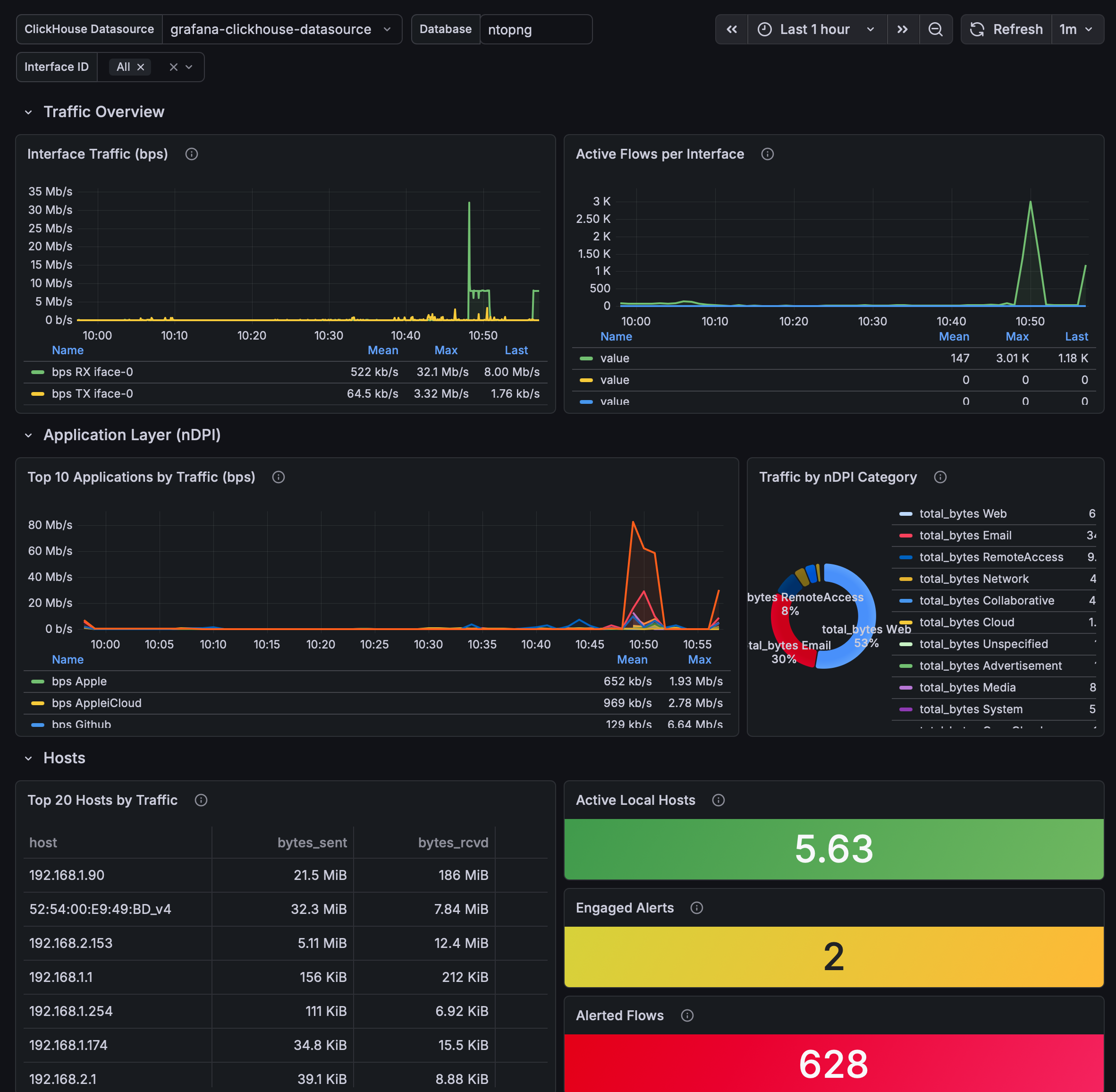
p.s. the image is not mine (I can't expose my data), but just for demonstrating the capabilities of the Grafana dashboard.
Why Do We Need Grafana Anyway
Grafana is great because it turns a stream of technical data into understandable visuals. This is especially important for production. Plus, it just looks nice.
When you have industrial equipment, a lot of signals, and constant data collection, a regular table just won't impress anyone. There are some numbers, but you can't read them with your eyes (imagine a week's collection of 1 billion signals?). A graph will immediately show what's happening: the collection is steady, there are gaps, polling time has increased, signal states have changed, etc.
This works very well for management too. You can show one screen where the dynamics and state of the system are visible in real-time. This greatly simplifies reporting: we discuss not my guesses, but real facts on the screen (use this life hack).
In this setup, ClickHouse is responsible for fast data storage and retrieval, while Grafana handles visualization. Roughly speaking, ClickHouse is the warehouse, and Grafana is the showcase.
Where to Start: First, Check the Database
I specifically didn't start with pretty graphs. First, I needed to understand what was actually in the database and how much I could trust this data.
ClickHouse already had a working database with two important entities: - a table with complete PLC samples; - a catalog of signals.
Each sample is one cycle of the controller's reading. Inside one row, there is the collection time, service information about the quality and duration of polling, as well as an array of values for n signals.
You need to check some simple but important things:
- how many rows have already been loaded;
- are there any duplicates;
- does the length of the array match the number of signals;
- are there any incomplete samples;
- are there any NULL values;
- does the signal catalog match the actual positions in the array.
How many values are in the catalog, do these values match those in each sample, check for duplicates and corrupted arrays. This is an important point: if you don't check the data quality first, Grafana will just beautifully depict an incorrect picture later.
Deploying Grafana in Docker
Grafana was deployed in a separate Docker container. For settings and dashboards, I used a persistent Docker volume so that everything wouldn't disappear after the container restarts.
Database: the container can be recreated, but the working settings should live separately.
Next, Grafana and ClickHouse were connected through a common Docker network. Thanks to this, Grafana connects to ClickHouse not through the external internet, but via the internal container address and the standard HTTP port of ClickHouse.
Externally, access to Grafana is configured through Nginx as a reverse proxy, with HTTPS and an SSL certificate on my domain. At the same time, the internal port of Grafana is not published directly to the internet. For a production environment, this is a normal minimum hygiene: we provide a neat entry point to the outside, not everything at once.
Connecting ClickHouse to Grafana
To connect to ClickHouse, I installed the official Grafana plugin for ClickHouse. After that, a new datasource appeared in Grafana.
A separate ClickHouse user was configured for the graphs. Important: this is not a user for logging into Grafana itself, but specifically an account through which Grafana reads data from the database.
I would recommend not using an admin account for such tasks. It's better to have a separate user with the minimally necessary read permissions. The dashboard usually doesn't need to change tables, delete data, or create anything in the database. Plus, it's generally safer.
After configuring the datasource, I checked that Grafana was actually receiving data from ClickHouse. This is a mandatory step before drawing panels: first, we ensure that the queries work, and only then do we focus on aesthetics.
What Panels I Assembled
The initial dashboard turned out to be simple. I specifically didn't want to create a "spaceship" with 40 graphs. At the first stage, it's more important to quickly see the basic state of the PLC → ClickHouse → Grafana chain.
1. Total PLC Samples
This is the simplest indicator: how many complete samples are saved in ClickHouse.
One sample equals one cycle of equipment reading, within which the values of all signals are contained. If the number increases after a new upload, it means the data is reaching the database.
2. Frequency of Initial Collection
This panel shows how many PLC reading cycles were completed per minute based on the initial collection time.
If the normal mode is about one poll per second, you would expect to see around 60 samples per minute on the graph. If the point is lower, it's not always an emergency: the current minute may not have finished yet, or only part of the data has been uploaded to ClickHouse.
This panel is useful because it immediately shows gaps in the collection. You don't need to manually count time gaps.
3. Total Reading Time of PLC
Here, I displayed the total reading time of all signals.
The average value for the current data was around 55–60 ms, while rare peaks reached about 100 ms. This already resembles a normal technical metric: you can monitor whether polling starts to degrade over time without using complex SQL queries.
4. Signal States
Another useful panel is the count of logical ones and zeros in the last sample.
It's important not to confuse: one and zero here do not mean "good" and "bad." They simply represent the current logical state of the signals. But as a quick overview of the last state of the equipment, this panel is very convenient.
5. Total Number of Readings Taken Over Time
It's also good to count the total number of individual PLC readings. This is simply the number of samples multiplied by the number of signals.
Such a figure helps explain the scale of the data. For example, hundreds of thousands of samples quickly turn into billions of individual values. For ClickHouse, this is a normal working story, and for a person in a meeting, such a figure immediately makes the task more tangible (use this life hack; management loves big, beautiful numbers).
The Main Takeaway: Grafana is Not Just a Pretty Cover for Unclear Data
A good dashboard starts with:
- first checking the data structure;
- looking for duplicates and corrupted arrays;
- ensuring that the signal catalog matches the real values;
- setting up a secure connection;
- checking that the data is actually updating;
- only then drawing panels.
And also: don't try to show everything at once. For the first working dashboard, a few honest graphs that answer simple questions are enough:
- are the data coming in or not;
- how often is the collection happening;
- how long does reading take;
- what is currently visible in the signals;
- how much data has already been accumulated.
Practical Benefits
If you're setting up monitoring of industrial equipment through Grafana and ClickHouse, I would go about it like this:
- Check the database before Grafana. Graphs won't save bad data.
- Create a separate ClickHouse user just for reading.
- Start with 3–5 panels, not a huge dashboard.
- Show not only signal values but also the health of the collection chain itself.
- Monitor the freshness of the data separately, so you don't look at a beautiful but outdated picture.
For me, this task became a good reminder: at the factory, the value of data appears not at the moment it hits the database, but when it can be quickly understood and conveniently shown to management. Grafana in conjunction with ClickHouse solves this task: from raw PLC samples to proper visual monitoring that is easy to view.